
3 top tips for Microsoft Excel 2016
Excel 2016 can be tough to use. But you don’t need to be a spreadsheet jockey if you want to get the most out of Excel 2016. Just follow these three tips.
The new Quick Analysis tool offers a great way to gain insights into your data. Highlight the cells you want to examine, then move your cursor to the lower right-hand corner of what you’ve highlighted. A small icon of a spreadsheet with a lightning bolt on it appears. Click it and you’ll get a variety of tools for performing instant analysis of your data.
One of them formats data in cells to call out important information, for example, using data bars or colors. Another suggests the best ways to chart the data. You also get recommendations for formulas to help you delve into the data, or create a table which you can mine for useful information. And you can also insert a variety of sparklines into the spreadsheet, mini-charts in a cell that summarizes a row of data points.
Make your choice, and Excel does the rest.
Excel has never been the most user-friendly of applications. But Excel 2016 has taken a good-sized step towards making it easier with a new feature called Tell Me, which puts even buried tools in easy reach.
To use it, click the “Tell me what you want to do” text, to the right of the View tab on the Ribbon. Then type in a task you want to do, such as “Create a pivot table.” You’ll get a menu showing potential matches for the task. Select the results that match what you want to do. In some cases, Excel is smart enough to even find the data you want to use. Simply follow the prompts for completing the task, in this instance, creating a pivot table to reorganize and summarize data.
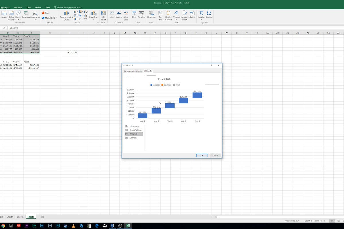
Finally, make sure to check out the half-dozen new charts Excel 2016 introduced: Treemap, Sunburst, Waterfall, Histogram, Pareto, and Box & Whisker. Each provides a unique way to display data visually. Here’s we’ll take a look at Waterfall.
Insert it as you would insert any chart, by highlighting the data you want to chart, then selecting Insert > Chart. A screen appears with a list of every chart type available. Here I’m choosing Waterfall, which is well-suited for visualizing financial statements. It displays a running total of the positive and negative contributions toward a final net value. Follow the normal prompts for inserting a chart.